
I have no idea how common this (supposed) problem is. Google showed quite a lot of posts about the Samsung Galaxy S5 touchscreen not working, but usually the posts don’t provide a solution that differs much from “perform a soft or hard reset” or “see if you have a screen cover attached”. So I suppose non-working Galasy S5 displays are not entirely unusual, but the reasons for their not working may, of course, vary. In fact, I’ve noted the touchscreen will sometimes be unresponsive for some time when the phone is performing calcultation intensive tasks.
In this case, however, the lack of response seemed to be more fundamental. About ten soft resets would not bring the phone back to life, but at some point, it seemed to register the touches in slow motion, and only about every tenth touch. So it became more and more apparent that there is a loose connection at work somewhere.
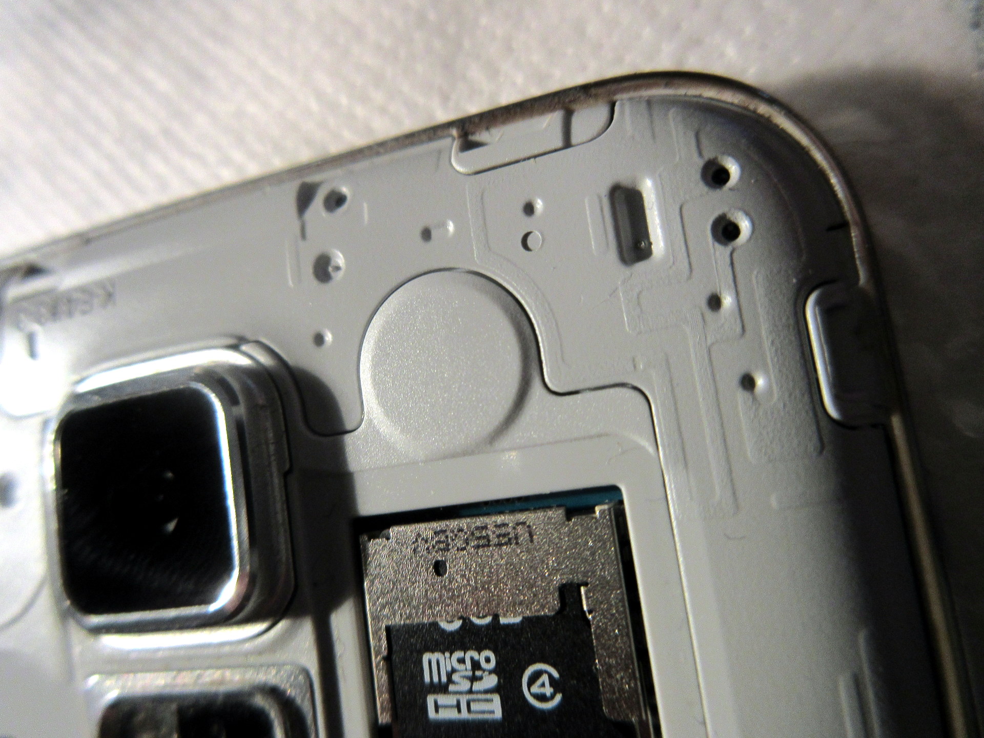
I did not want to open the phone – as I could still have it replaced by my mobile phone operator – so I had to look up pictures of disassembled Galaxy S5 units to see if it could be possible to specifically shake the phone or apply pressure to a specific area. Turns out, that was a very good idea. A quick Google search led me to this article on ifixt.com which allowed me to I identify both the positions of the display connector and the touchscreen controller chip.
In my case, it seems the touchscreen controller chip was the culprit, as even a modest amount of pressure applied to the round area above the SD-card holder was sufficient to instantly wake up the touchscreen. To make things even easier for anyone reading this, I’ve just taken a picture of the spot.
